TIP
# 本篇:媒体查询解决uniapp-构建H5在浏览器打开后宽度100%的问题
前言:之前用uniapp写H5 web网站时,未注意page宽度,在pc端访问网站时页面被撑满,页面视觉效果就很差了,如下图:
页面、底部导航栏被拉成这样,很难看。
- 解决方法:使用媒体查询@media (opens new window) 来判断当前媒体宽度,当媒体宽度大于750px时,固定页面宽度为750px,以及处理底部导航栏固定宽度750px。 最终可完美解决!
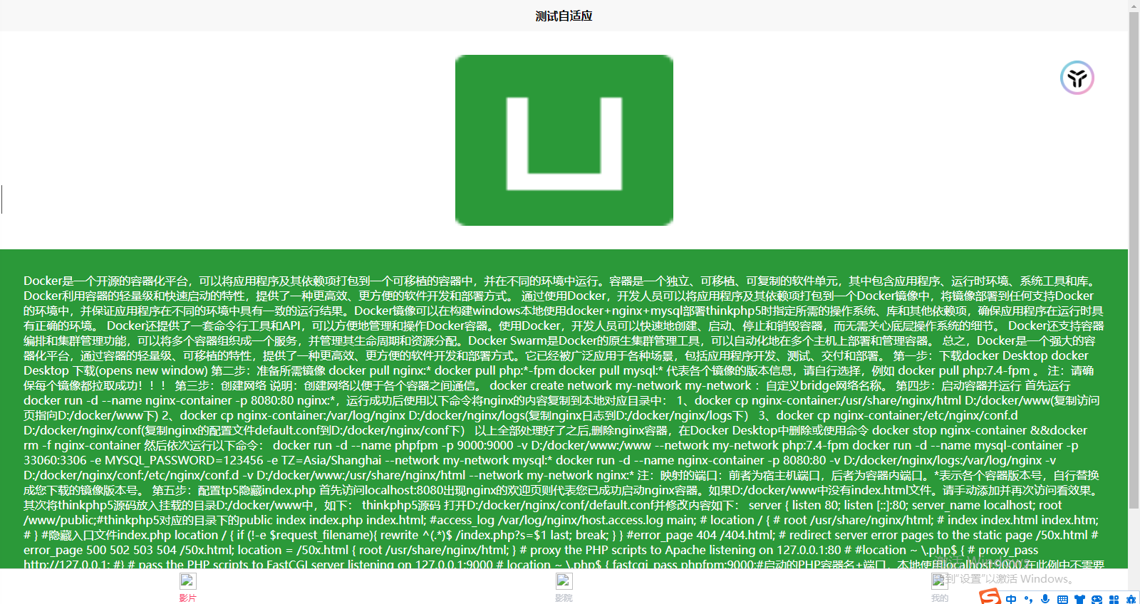
# 实现的最终效果:
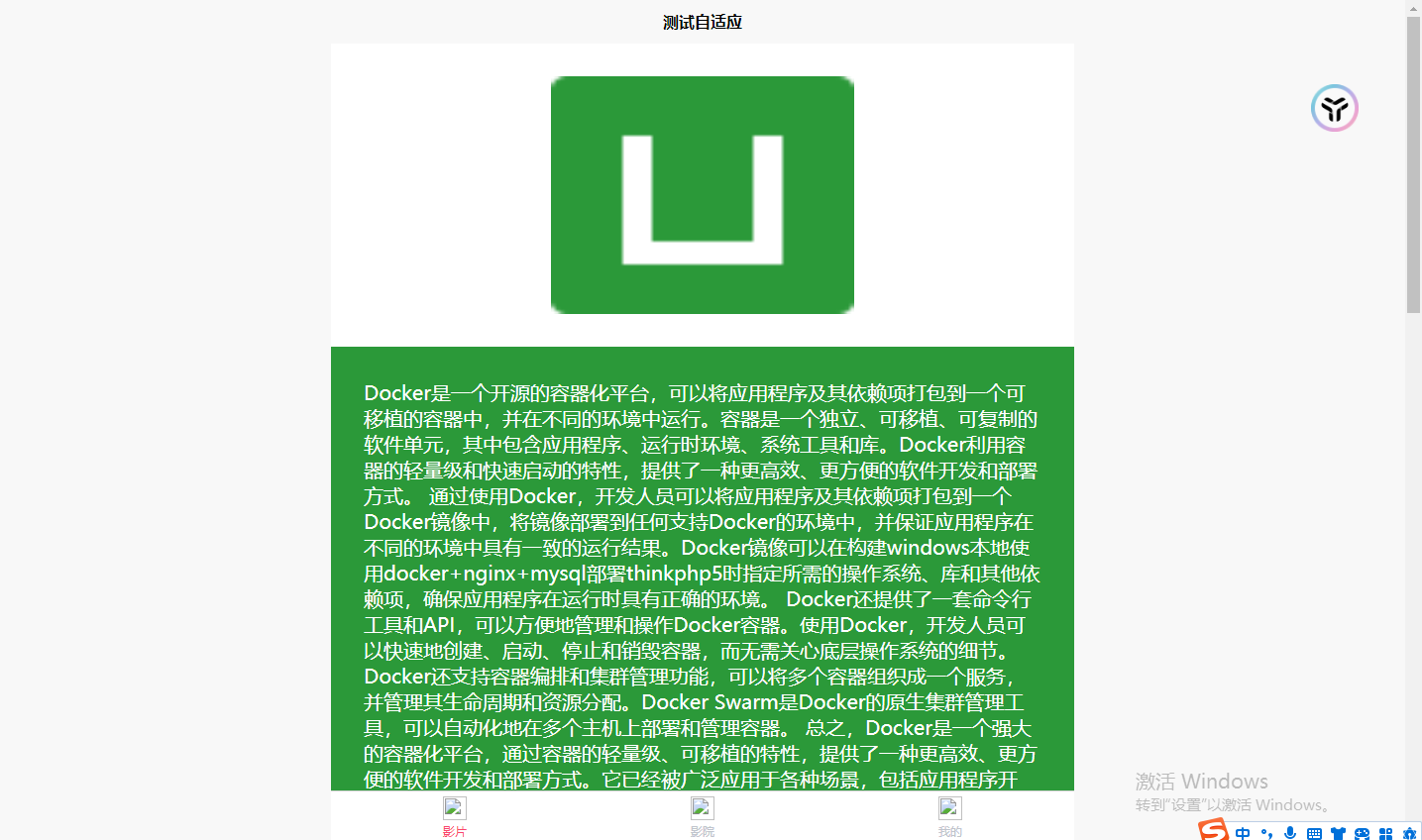
App.vue文件中css代码如下:
<style>
	/*每个页面公共css */
	/* #ifdef WEB */
	page {
		display: flex;
		flex-direction: column;
	}

	.content {
		width: 100%;
		align-items: center;
		justify-content: center;
		display: flex;
		flex-direction: column;

	}

	/* 当设备宽度大于750px时,div固定宽度750px */
	@media only screen and (min-width: 750px) {
		page {
			width: 750px !important;
			margin: 0 auto !important;/* 设置页面宽度内容居中显示 */
			background-color: #F8F8F8;
			font-size: 20px !important;
		}

		.content {
			width: 750px !important;
			background-color: #ffffff;
		}

        /* 设置底部导航栏固定宽度750px !important确保生效 */
		.uni-tabbar {
			width: 750px !important;
			margin: 0 auto !important;
		}
	}

	/* #endif */
</style>
1
2
3
4
5
6
7
8
9
10
11
12
13
14
15
16
17
18
19
20
21
22
23
24
25
26
27
28
29
30
31
32
33
34
35
36
37
38
39
40
41
2
3
4
5
6
7
8
9
10
11
12
13
14
15
16
17
18
19
20
21
22
23
24
25
26
27
28
29
30
31
32
33
34
35
36
37
38
39
40
41
- 主要看效果文件代码
效果文件pages/index/index 文件代码如下:
<template>
	<view class="content">
		<image mode="heightFix" class="logo" src="../../static/logo.png"></image>
		<view class="box">
			这里面是一些可以自定义的内容!!!
		</view>
	</view>
</template>

<script>
	export default {
		data() {
			return {
				title: 'Hello'
			}
		},
		onLoad() {

		},
		methods: {

		}
	}
</script>

<style>
	.logo{
		width: 100%;
		padding: 30rpx 0;
	}

	.box{
		height: auto;
		padding: 30rpx;
		background-color: #2B9939;
		color: #ffffff;
	}
</style>
1
2
3
4
5
6
7
8
9
10
11
12
13
14
15
16
17
18
19
20
21
22
23
24
25
26
27
28
29
30
31
32
33
34
35
36
37
38
39
40
41
2
3
4
5
6
7
8
9
10
11
12
13
14
15
16
17
18
19
20
21
22
23
24
25
26
27
28
29
30
31
32
33
34
35
36
37
38
39
40
41
向上面这样添加代码之后,你会发现:
- 页面内容看起来更美丽了
- 底部导航栏也美丽了
- 心情也美丽了
结语:我爱媒体查询@media (opens new window),自己亲手写自适应还是挺不错的,虽然只是一个简单的例子,不过也很棒了!!!
🎉 💯